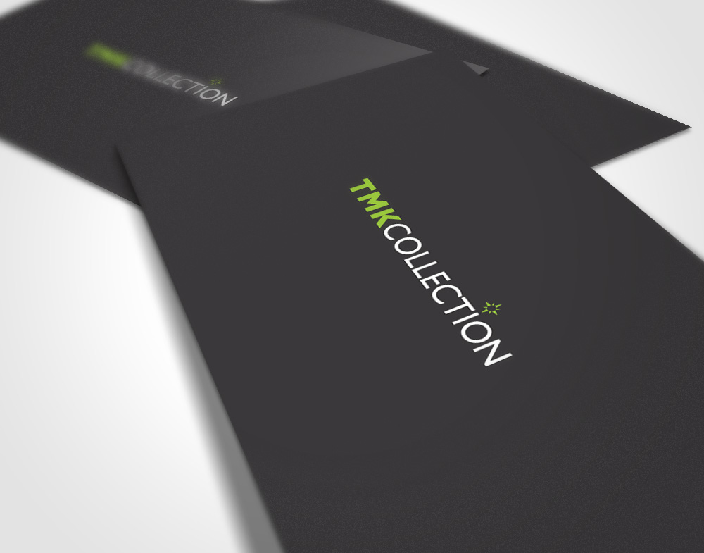
TMK Collection
Back in 2004 we created the Corporate ID for “The Marketing Collection”, a company specializing in marketing and public relations for high-level tourism products.
Ten years later the company needed a logo redesign that could better represent their new services.
To achieve this we crafted a new logo that uses the classic star-shaped compass as part of the “i” letter. By doing this we convey both the ideas of ”traveling” and “high quality services” as the star symbol is strongly linked to the latter concept (especially in the tourism industry).