Logo design for Law Firm
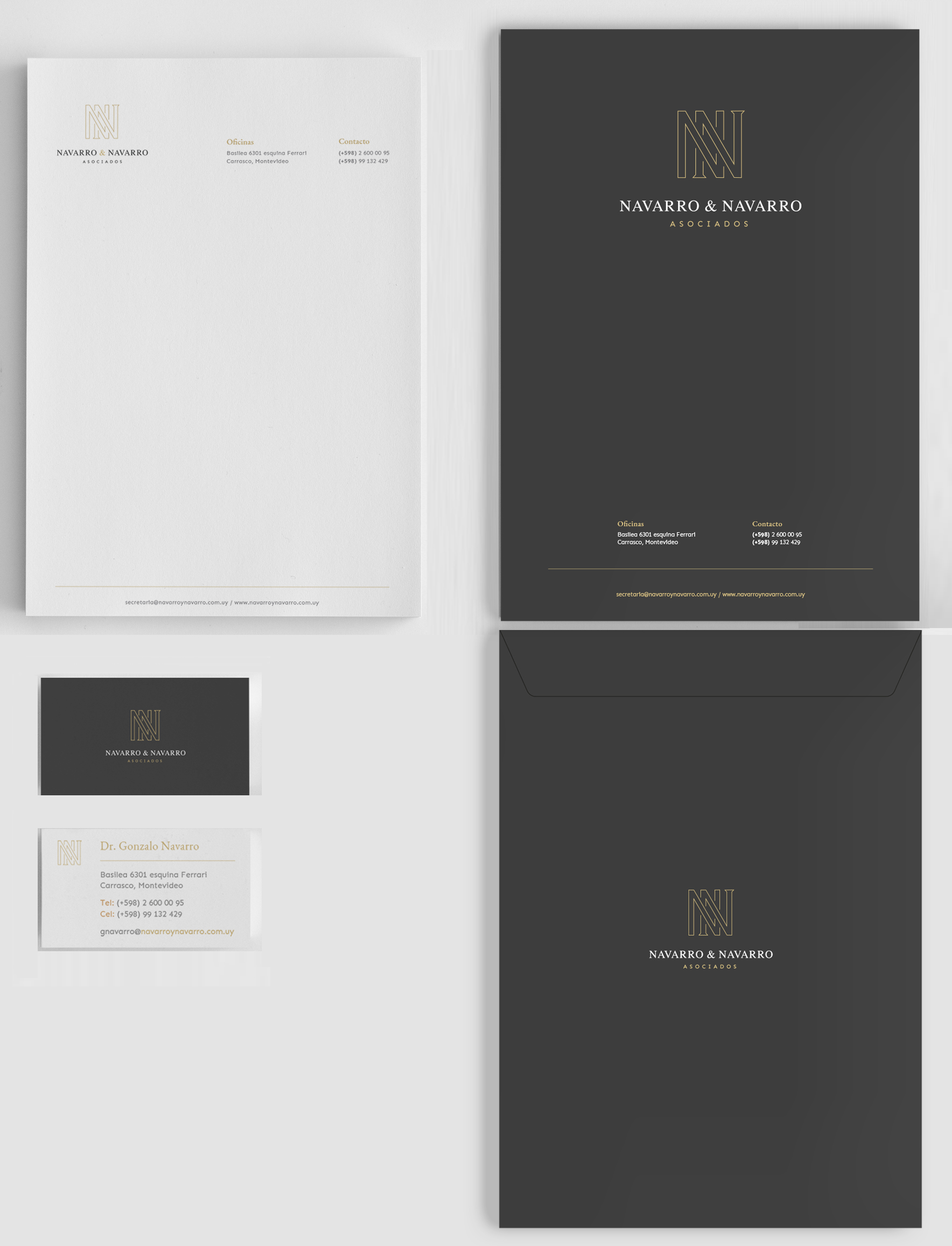
Navarro & Navarro, a family law firm, contacted QB Media in search of a rebranding. We designed a new identity based on a monogram created using the intertwined initials that give the firm its name. One of the “N” letters uses serif elements to denote a classic approach while the other – without serif – represents the new generation of family lawyers. This forms an elegant monogram that represents the different generations of the Navarro family that run the firm.
For the stationery and business cards, we created sober and elegant designs that reinforce what is transmitted by the logo.
Related work: Web design for Law Firm
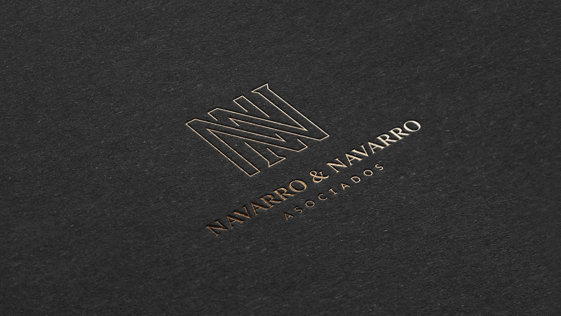
· Monograms express hierarchy, they are alien to the design fashions and are the best option to create collateral elements – for example – stamps.
· The hard angles together with the selected typography create a logo with a classic and modern style, conveying a feeling of stability, solidity and timelessness.
· The typeface used for the name of the studio reinforces this concept as it is a modern version of a classic font (more rounded and with small serifs).
· The typography used for the word “Associates” is modern and balances the rest of the logo.
· The use of gold ink over a dark background gives a feeling of excellence.